Typography in Packaging Design

Typography might not be the first element that comes to mind when thinking about packaging design, but it's one of the most powerful tools in a designer's arsenal. From conveying essential product information to expressing brand personality, the fonts you choose and how you use them can make or break your packaging's effectiveness.
In this comprehensive guide, we'll explore the critical role of typography in packaging design and provide practical insights for making typographic choices that enhance your products' shelf appeal and brand communication.
Why Typography Matters in Packaging
Before diving into specific techniques and examples, let's understand why typography deserves careful consideration in packaging design:
1. Instant Communication
Consumers spend mere seconds deciding whether to pick up a product. Typography must quickly communicate what the product is, who it's for, and why it's worth considering. Well-chosen fonts instantly convey key messages without requiring consumers to read every word.
2. Brand Identity Expression
Typography is a powerful carrier of brand personality. Whether your brand is playful, premium, traditional, or cutting-edge, your font choices should align with and reinforce these attributes. Consistent typography across product lines builds brand recognition and loyalty.
3. Information Hierarchy
Effective packaging guides consumers through information in a logical sequence. Typography creates visual hierarchy that directs attention to the most important elements first, then leads the eye through secondary and tertiary information.
4. Regulatory Compliance
Most products must include specific information like ingredients, nutrition facts, warnings, or usage instructions. Typography must make this mandatory content legible and accessible while maintaining design integrity.
5. Differentiation
In crowded market categories, distinctive typography can help your product stand out. A unique typographic approach can create visual "ownership" that distinguishes your product from competitors.
Key Typography Elements in Packaging Design
Successful packaging typography requires attention to several core elements:
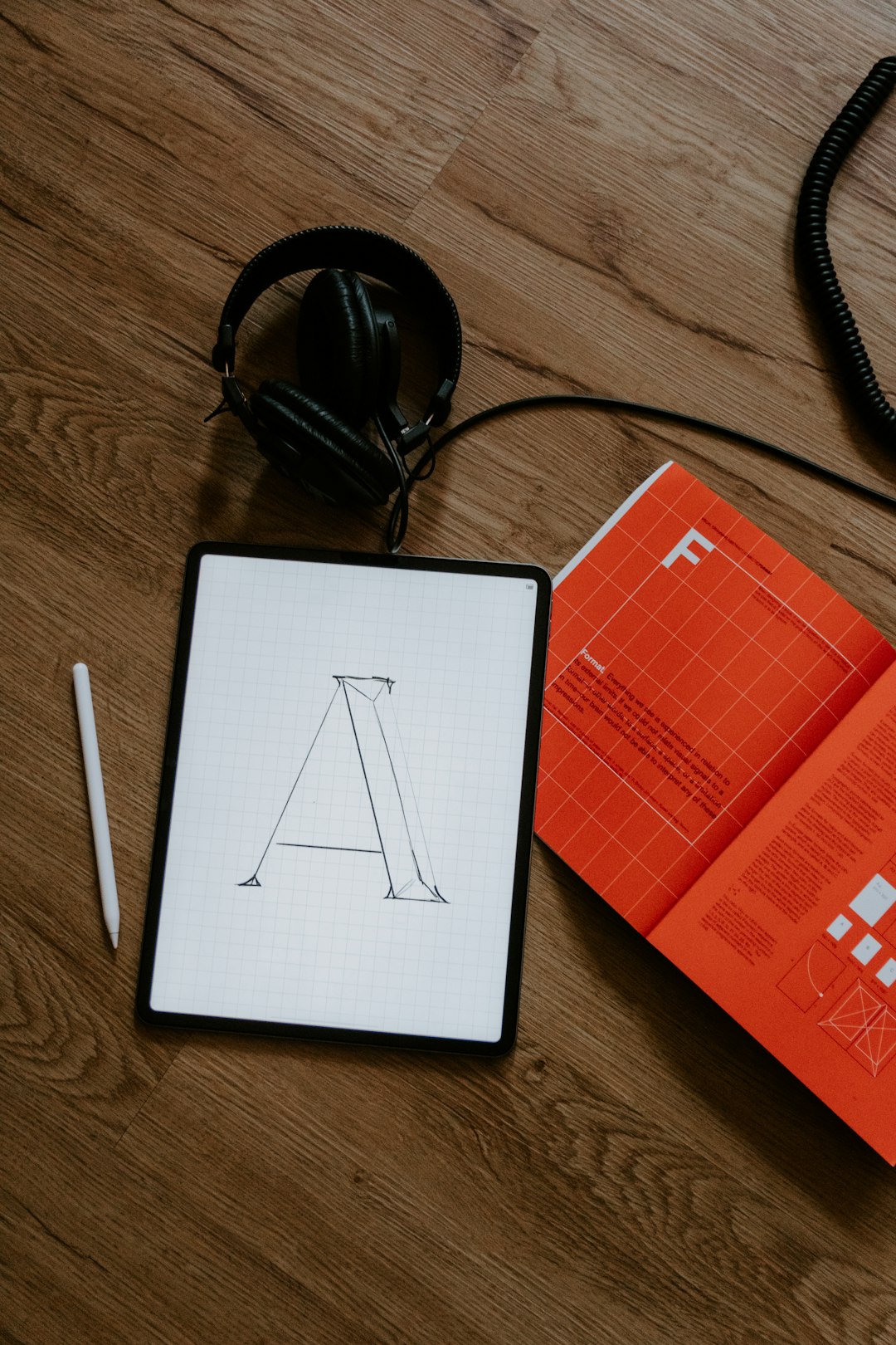
Font Selection
Choosing the right typefaces is fundamental to packaging design. Consider these factors when selecting fonts:
Font Categories
- Serif fonts (Times New Roman, Baskerville) convey tradition, reliability, and heritage. They work well for premium, classic, or academic-oriented products.
- Sans-serif fonts (Helvetica, Gotham) project modernity, cleanliness, and straightforwardness. They're ideal for contemporary, minimalist, or tech-focused products.
- Script fonts (Bickham Script, Burgues Script) suggest elegance, craftsmanship, and personal touch. They're effective for luxury, artisanal, or romantic products.
- Display fonts (Impact, Bebas Neue) create bold statements and high visibility. They work for products that need to grab attention quickly.
- Hand-lettered fonts communicate authenticity, craftsmanship, and uniqueness. They're perfect for artisanal, organic, or independent brands.
Brand Alignment
Your font choices should reflect your brand values and positioning. A premium chocolate brand might use elegant serifs or scripts, while an organic snack brand might choose friendly, rounded sans-serifs or rustic hand-lettered styles.
Font Personality
Each font has its own "personality" beyond its technical classification. Some sans-serifs appear friendly and approachable (like Avenir), while others seem more technical and precise (like Univers). Match these subtle characteristics to your brand attributes.
Hierarchy and Structure
Effective packaging typography guides the eye through information in a deliberate sequence:
Primary Information
The product name or type should typically be most prominent, using larger size, bolder weight, or contrasting color to ensure it's seen first.
Secondary Information
Brand name, product benefits, or key differentiators come next in the visual hierarchy, using moderate emphasis to attract attention after the primary elements.
Tertiary Information
Supporting details, ingredients, usage instructions, and regulatory information should be clearly legible but visually subordinate to more important messages.
Creating Contrast
Establish hierarchy through contrasts in:
- Size: Larger text naturally draws more attention
- Weight: Bolder fonts create emphasis
- Style: Italic or oblique versions add distinction
- Color: Higher contrast colors stand out
- Spacing: Looser tracking can add prominence


Legibility and Readability
Even the most beautiful typography fails if consumers can't read it easily:
Size Considerations
Text must be large enough to read at typical viewing distances. For primary information, consider how the product will appear on shelves. For regulatory information, ensure compliance with minimum size requirements.
Contrast
Maintain sufficient contrast between text and background. Dark text on light backgrounds or vice versa creates optimal readability. Avoid placing text over busy patterns or images without sufficient contrast enhancement.
Line Length and Spacing
For longer text blocks, limit line length to 50-60 characters and maintain adequate line spacing (leading) to prevent eye strain and improve readability.
Text Placement
Consider where text falls in relation to folds, seams, or structural elements of the packaging. Avoid placing important information where it might be obscured or distorted.
Typography Trends in Packaging Design
While timeless principles of good typography remain constant, several trends are currently influencing packaging design:
Minimalist Typography

Clean, simple typography with ample white space has gained popularity across categories. This approach emphasizes clarity and focuses attention on essential information while creating a premium, sophisticated feel.
Key characteristics:
- Sans-serif fonts with uniform stroke weights
- Generous negative space
- Limited color palette
- Careful alignment and grid-based layouts
Example: Beauty brand Glossier uses simple sans-serif typography with ample white space to create a clean, modern aesthetic that emphasizes product purity and simplicity.
Vintage Revival
Many brands are looking to the past for typographic inspiration, using vintage-inspired letterforms to evoke nostalgia and authenticity. This trend is particularly strong in food, beverage, and personal care categories.
Key characteristics:
- Revival of historical type styles (Art Deco, Victorian, Mid-Century)
- Decorative serifs and ornamental details
- Hand-drawn or imperfect letterforms
- Typography as a primary decorative element
Example: Craft spirits brands often use elaborate vintage-inspired typography that references historical printing techniques to suggest traditional craftsmanship and time-honored recipes.

Bold Typography as Visual Element
Typography is increasingly being used as the primary visual element on packaging, with oversized letterforms, creative layouts, and expressive type treatments replacing traditional imagery.
Key characteristics:
- Super-sized typography that dominates the design
- Creative letter arrangements and layouts
- Experimental typographic treatments (distortion, dimension, texture)
- Limited or no additional imagery
Example: Help Remedies uses oversized, simple typography as the main visual element on their packaging, with product names like "Help I Have a Headache" clearly communicating purpose while creating a distinctive look.
Custom Typography
Brands seeking unique identity are increasingly investing in custom or modified typography rather than relying on stock fonts. This approach creates proprietary visual assets that can't be easily replicated by competitors.
Key characteristics:
- Bespoke letterforms designed specifically for the brand
- Modified existing typefaces with unique characteristics
- Typography that integrates brand symbolism or product attributes
- Consistency across packaging and broader brand applications
Example: Coca-Cola's distinctive script is perhaps the most recognizable custom typography in packaging, creating instant brand recognition even without the logo or red background.
Common Typography Challenges in Packaging Design
Packaging designers face several typical challenges when working with typography:
Limited Space vs. Required Information
Packaging often needs to include substantial information in a confined space. To address this challenge:
- Use space-efficient fonts designed for small sizes (like Verdana or Source Sans Pro)
- Create clear information zones with distinct purposes
- Consider expandable elements like peel-back labels for additional information
- Use QR codes to move some information online
- Prioritize ruthlessly, focusing on what consumers most need to know
Multilingual Requirements
Products sold in multiple markets often need information in several languages. Solutions include:
- Choose fonts with extended language support
- Design flexible layouts that accommodate text expansion (some languages require more space than English)
- Use universal icons where possible to reduce text requirements
- Consider separate packaging versions for significantly different language markets
Regulatory Compliance
Many products must meet specific typographic requirements for certain information:
- Stay updated on regulations in your market categories and regions
- Work with legal experts to ensure compliance
- Design regulatory elements early in the process rather than trying to fit them in later
- Find creative ways to integrate mandatory elements without compromising design integrity
Production Limitations
Printing and production processes can affect typography reproduction:
- Consider how printing methods might affect fine details or small text
- Test typography on actual packaging materials, as surface texture can impact legibility
- Account for potential ink spread on absorbent surfaces
- Ensure reversed-out (white) text is bold enough to remain legible after production
Practical Typography Tips for Packaging Success
To elevate your packaging typography, consider these practical recommendations:
1. Limit Your Font Palette
Resist the temptation to use too many different fonts. Most successful packaging designs use just 2-3 font families, creating variety through different weights and styles within those families. This approach ensures cohesion while still allowing for hierarchy and emphasis.
2. Test at Actual Size and Distance
Always evaluate your typography at the size it will appear on the final packaging and from typical viewing distances. What looks perfectly legible on your computer screen might be challenging to read on a store shelf. Create physical mockups and test them in realistic environments.
3. Consider the Complete Product Line
Design typography with extensibility in mind. Will your approach work across product variations, different package sizes, or future line extensions? Create a flexible system rather than a one-off solution.
4. Balance Distinction and Recognition
Your typography should be distinctive enough to stand out but familiar enough to be instantly readable. Extremely unusual fonts might grab attention but can sacrifice legibility and quick comprehension.
5. Integrate Typography with Other Design Elements
Typography should work harmoniously with other packaging elements like color, imagery, and structure. The most successful designs create unity between typographic choices and overall package design.
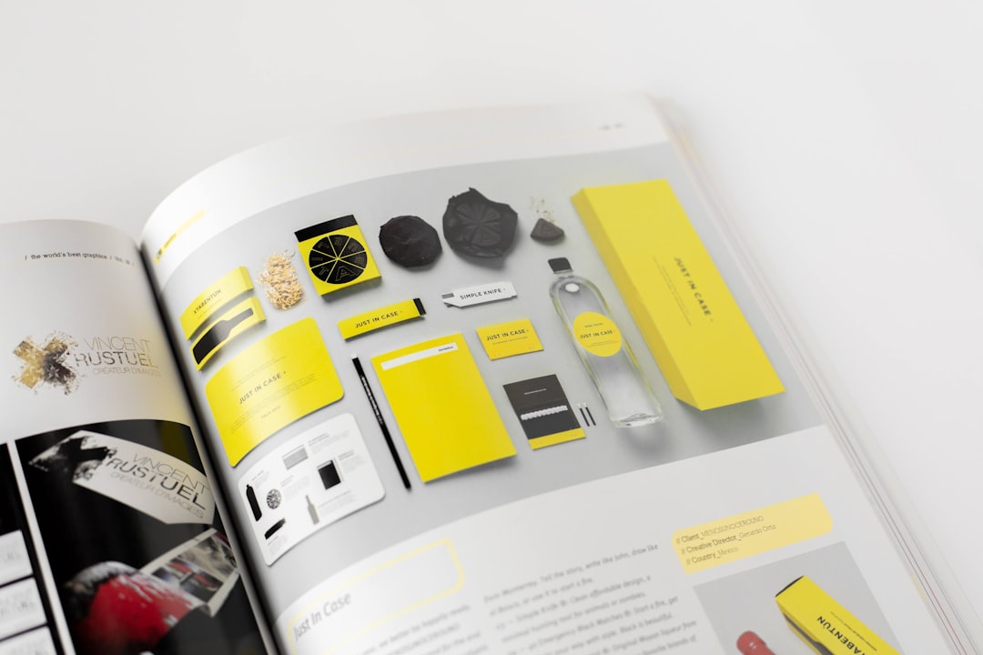
Case Studies: Effective Typography in Packaging
Method Home Products
Typography Approach: Method uses a clean, modern sans-serif font family across all products, with generous white space and a clear hierarchy that emphasizes product type.
Why It Works: The simple, approachable typography reinforces Method's brand positioning as a friendly, design-conscious alternative to traditional cleaning products. The consistent typographic system creates strong brand recognition across a diverse product range while allowing for clear differentiation between product varieties.
Key Takeaway: A simple, consistent typographic system can create a strong brand presence while accommodating extensive product variations.
Seedlip Non-Alcoholic Spirits
Typography Approach: Seedlip combines elegant serif typography for its logo with clean sans-serif information hierarchy, integrated with intricate botanical illustrations.
Why It Works: The contrast between the refined serif brand mark and contemporary information typography creates a sophisticated, premium feel that positions Seedlip as a high-end alternative to alcoholic spirits. The typography works in harmony with the detailed illustrations, neither competing with nor being overwhelmed by them.
Key Takeaway: Thoughtful contrast between typographic styles can create rich, layered brand expressions that signal premium positioning.
RXBAR
Typography Approach: RXBAR uses bold, minimal typography as the central design element, with ingredients prominently listed on the front in a straightforward manner.
Why It Works: The no-nonsense typographic approach perfectly aligns with the brand's positioning around transparency and simplicity. By elevating the ingredient list to become the primary visual element, RXBAR differentiates itself in the crowded protein bar category while communicating its key value proposition of clean, simple ingredients.
Key Takeaway: Typography can serve as both information and brand statement, particularly when it embodies core brand values like transparency.
Conclusion
Typography in packaging design is far more than just words on a box or label—it's a powerful communication tool that shapes consumer perceptions, guides purchasing decisions, and builds brand recognition. By giving typography the strategic attention it deserves, brands can create packaging that not only looks good but effectively communicates at every level.
The most successful packaging typography strikes a balance between standing out and fitting in—distinctive enough to differentiate your product but familiar enough to be instantly understood. It considers both aesthetic appeal and functional requirements, creating solutions that work in real-world retail environments.
At Hellvcase, we approach typography as an integral part of the overall packaging design strategy, ensuring that every letterform contributes to telling your brand's unique story. Contact us to discuss how we can help you harness the power of typography in your packaging design.

Comments (1)
Robert Nguyen
March 10, 2024Thank you for this comprehensive article! As someone just starting in package design, I've been struggling with typography decisions. The section on hierarchy was particularly helpful, and I loved the case studies that show how theory translates to real-world examples. Would love to see a follow-up piece specifically on typography for small packages where space is extremely limited.
Leave a Comment