The Psychology of Packaging Colors
In the competitive world of retail, your product has mere seconds to grab a consumer's attention. Color is one of the most powerful tools in packaging design, capable of influencing perception, evoking emotions, and even affecting purchasing decisions. Understanding the psychology of color in packaging design can give your products a significant edge in the marketplace.
Why Color Matters in Packaging
Studies show that up to 90% of snap judgments made about products can be based on color alone. Color influences not just attention and recall, but also how consumers perceive the quality, value, and function of a product before they even pick it up.
The strategic use of color in packaging can:
- Communicate brand identity and values
- Differentiate products from competitors
- Influence perceived product attributes (premium, natural, energetic, etc.)
- Target specific demographic groups
- Guide consumers to make certain associations with the product
The Emotional Language of Colors
Each color evokes specific emotional responses and associations. Here's a breakdown of common colors used in packaging and their psychological impacts:
Red
Emotions: Excitement, passion, urgency, energy
Associations: Bold, attention-grabbing, appetite-stimulating
Best for: Food products, impulse purchases, sales, clearance items
Examples: Coca-Cola, Netflix, Nintendo
Blue
Emotions: Trust, calm, reliability, security
Associations: Professional, dependable, clean, peaceful
Best for: Tech products, banking, healthcare, water, cleaning products
Examples: Oral-B, PayPal, Dell, Facebook
Green
Emotions: Growth, health, tranquility, freshness
Associations: Natural, organic, eco-friendly, wholesome
Best for: Organic products, health foods, sustainability-focused brands
Examples: Whole Foods, Animal Planet, Tropicana
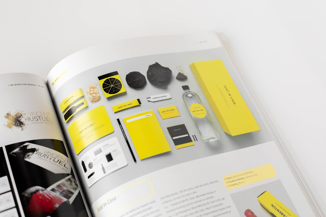
Yellow
Emotions: Optimism, happiness, warmth, energy
Associations: Cheerful, attention-grabbing, youthful, affordable
Best for: Children's products, budget offerings, food items
Examples: McDonald's, IKEA, National Geographic
Orange
Emotions: Enthusiasm, creativity, determination
Associations: Friendly, energetic, adventurous, affordable
Best for: Products targeting youth, outdoor/adventure items, creative tools
Examples: Fanta, Nickelodeon, Amazon
Purple
Emotions: Luxury, wisdom, creativity, mystery
Associations: Premium, royal, sophisticated, imaginative
Best for: Luxury products, beauty items, anti-aging, spiritual products
Examples: Cadbury, Hallmark, Yahoo
White
Emotions: Purity, simplicity, cleanliness, innocence
Associations: Minimalist, modern, clinical, honest
Best for: Premium products, health items, minimalist brands
Examples: Apple, milk products, pharmaceutical items
Black
Emotions: Power, elegance, sophistication, authority
Associations: Luxury, exclusive, bold, timeless
Best for: Premium products, luxury items, sophisticated tech
Examples: Chanel, Nike, Sony
Cultural Considerations
It's essential to remember that color associations can vary significantly across different cultures. For instance:
- While white symbolizes purity and cleanliness in Western cultures, it's associated with mourning in many Eastern cultures.
- Red signifies luck and prosperity in China but can represent danger or warning in Western contexts.
- Purple is linked to royalty in many Western countries but can symbolize mourning in some parts of Europe.
For global brands, thorough research into color perceptions across target markets is crucial before finalizing packaging designs.
Strategic Color Application in Packaging
Beyond understanding individual color meanings, successful packaging design requires strategic application of colors:
1. Brand Consistency
Your packaging colors should align with your overall brand identity. Consistent use of color across all touchpoints strengthens brand recognition—think of Tiffany's distinctive blue or Coca-Cola's red.
2. Product Category Conventions
Some product categories have established color conventions that consumers intuitively recognize. For example, dairy products often use blue and white, while organic foods frequently employ green packaging. You can either follow these conventions for immediate product recognition or intentionally break them to stand out.
3. Color Combinations
The relationship between colors is just as important as the individual colors themselves. Complementary colors (opposite on the color wheel) create vibrant contrast, while analogous colors (adjacent on the wheel) create harmony. High contrast combinations catch attention, while subtle combinations often convey sophistication.
4. Target Audience Considerations
Different demographic groups respond to colors differently:
- Studies suggest men tend to prefer bold colors, while women often respond to softer hues.
- Younger audiences may be drawn to bright, vibrant colors, while older demographics might prefer more subdued tones.
- Premium products targeting affluent consumers often use muted, sophisticated color schemes.
Case Studies: Successful Color Psychology in Packaging
Tiffany & Co.'s Iconic Blue Box
The distinctive "Tiffany Blue" packaging has become so iconic that it's protected as a trademark. This specific shade evokes feelings of exclusivity and luxury, creating anticipation before the product is even revealed. The color has become so synonymous with the brand that the packaging itself has become as valuable as the products inside.
Method's Colorful Cleaning Products
Method disrupted the cleaning products industry by using bright, attractive colors for their packaging instead of the clinical whites and blues of traditional cleaning products. This color strategy reinforced their brand positioning as a fun, design-focused, and eco-friendly alternative in a previously utilitarian category.
Testing Color Impact
Before finalizing packaging colors, consider these testing approaches:
- A/B testing: Create multiple color variations and test consumer preference and response.
- Eye-tracking studies: Determine which color schemes attract the most visual attention.
- Focus groups: Gather qualitative feedback on the emotions and associations different color options evoke.
- Shelf tests: Evaluate how your packaging colors perform in the actual retail environment alongside competitors.
Conclusion
Color is far more than just an aesthetic choice in packaging design—it's a powerful psychological tool that influences consumer perception and behavior. By understanding the emotional language of colors and strategically applying this knowledge to your packaging, you can create designs that not only catch the eye but also communicate your brand values and connect with your target audience on a deeper level.
At Hellvcase, we incorporate the psychology of color into every packaging project, ensuring that every hue, tone, and shade works to support your brand messaging and product positioning. Contact us to discover how we can help you harness the power of color in your packaging design.

Comments (3)
Sarah Thompson
June 17, 2024This is such an insightful article! I've been struggling to choose the right colors for my product packaging, and this breakdown of color psychology is exactly what I needed. The case studies were particularly helpful.
David Chen
June 16, 2024Great article! I'd be interested to know more about how cultural differences affect color perception in global markets. We're expanding to Asia next year and want to make sure our packaging translates well.
Emily Richardson
June 16, 2024Thanks for your question, David! Cultural considerations in color are definitely crucial for global brands. I'd be happy to write a follow-up article specifically focused on cross-cultural color psychology in packaging. In the meantime, feel free to reach out directly if you'd like to discuss your specific Asian market expansion.
Leave a Comment